
Bar Chart Example
-
The numbers of murders in Canada are displayed in the bar chart
below, by region. You can see that Ontario has more murders
than other parts of Canada, and the North has very few murders.
Does this mean that Ontario is dangerous?
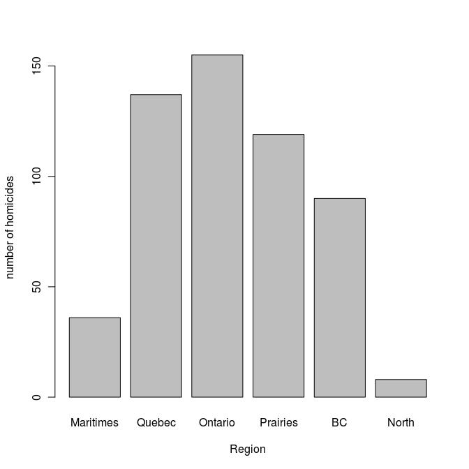
Click on the graph to see the code used to create the plot.
- To decide which region of Canada is safest, it is better
to take population into account. We can do this by dividing
the numbers of murders in a region by the region's population.
This gives us the murder rates and is plotted below.
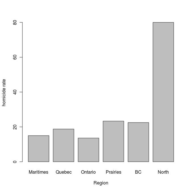
Click on the graph to see the code used to create the plot.